top of page
ISP Hoodie
Designing the graphic for our graduate hoodies at my high school
 Initial sketches for emblem |  initial layout ideas for the writing on the back |  Toying with graduation concepts such as branching out and going off in the world to other places |
|---|---|---|
 Starting to play with creating my own font, incorporating the iconic Eiffel Tower not far from the school |  Playing with shape and now using school colours. Thinking about making it compact to fit on the front left side as well. | 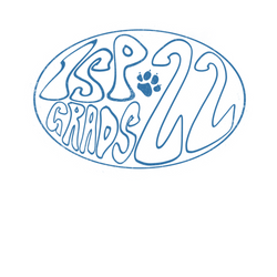 Here I am playing with the font I created, as well as including part of our school mascot. |
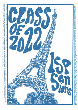 This is where I started to finalise my idea. I decided to keep the Eiffel Tower and distort it to make it more playful. I also then fit my font into the negative space around the tower. |  Also sent in a black version with a blue background. I moved the names of students inside the box as requested by the student council so that the printing would be easier and cheaper. |  This was the final design for the front side of hoodie. |
 This is the final design on the hoodie and what was printed and distributed to the graduating class. | 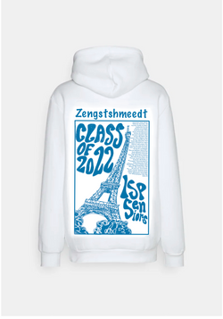 Final design including Last Name written on the back |
Apple Juice Label
Designing an apple juice label for The Grocer at 33, London.
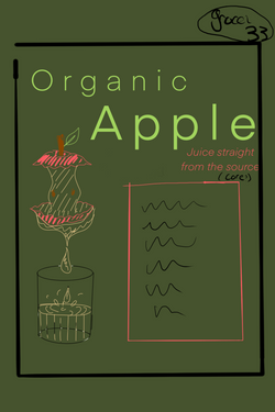 Original design idea. I wanted to use green because the apple juice is organic, but the client wanted it to be vibrant and fun so I used bright colours to juxtapose. I used the core of the apple to demonstrate a juiced apple wanting to indicate freshness and the lack of processing. |  This was my second design. I felt the core was too closely associated with a rotten or eaten apple so I chose to present it this way instead. I wanted to keep the idea of the juice pouring straight from the apple into the glass. I paced the writing between the glass and the apple. But, in the end, there was not enough space for the ingredients as well given that there was no back label for the juice. |  This was my final design. The client really liked the half cut apple and the tumbler that incorporated the logo. I kept a playful, elementary feel with the bold font and overlapping rectangles and maintained the green to keep the organic feel |
|---|
bottom of page